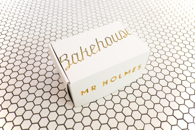
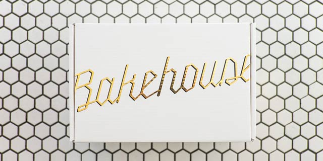
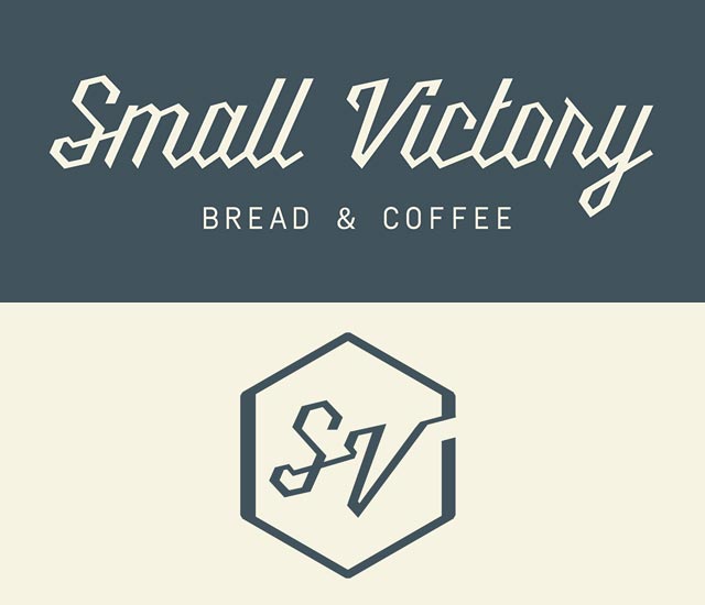
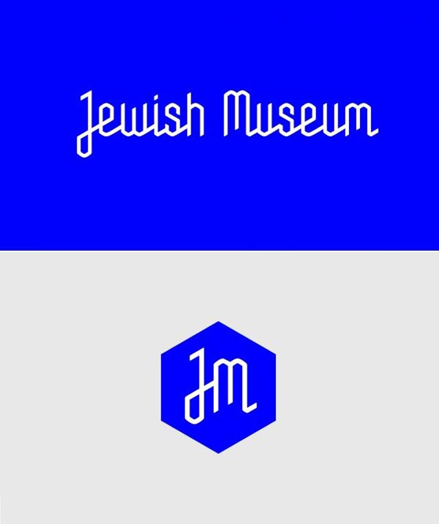
I recently wrote a post about identity design and the struggle to be original. In that post I compared 2 identity designs that were similar in style. While doing some project research, I discovered another brand that has a very similar identity design. Is this style a trend for 2015. Goodbye san serif hello jagged geometric script type?
Anyone know if there’s a typeface out there that these are all based on? I know for a fact the Jewish Museum logo was a custom font, but I wonder if it was loosely based on something.
Here’s my latest discovery. Mr Holmes Bakehouse in San Francisco.
Here’s the other brands I mentioned in my previous post.


What a fun comparison! You should make this a regular thing… also, that Bakehouse branding is so lovely!
Thanks Colleen. I hope to find more comparisons like this. This one just really stood out to me. I really love the Bakehouse branding too!
https://www.youworkforthem.com/font/T4603/millie
Awesome! Thanks for a source Andrew!